Forex Trading Software An Ichimoku Charts explained
Post on: 7 Апрель, 2015 No Comment
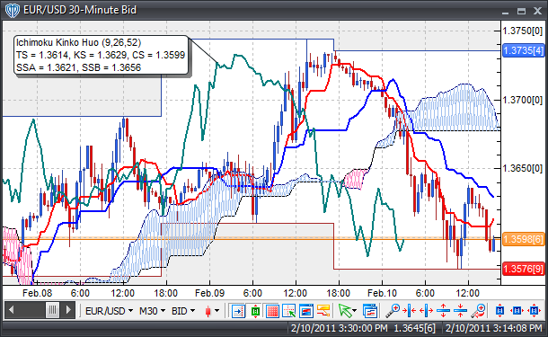
SIMILAR BUT DIFFERENT By and large, the calculations for ichimoku charts are similar to moving average techniques but use the historical highs and lows rather than a series of closing prices. Hosoda believed that midpoints within a time span reflect price characteristics much better than means.
Note the key time spans of nine, 26, and 52 days in his formulas. The time span of 26 days would correspond to the number of business days (Saturdays included) in one month when this charting method was devised and tested. So the time horizons of nine, 26, and 52 days represent a week and half; a month; and two months, respectively.
Some other values of these time spans may be more predictive when the chart is used in today’s markets. As an illustrative example, I’ve followed the original ichimoku formulas to present Figure 1, a chart of the gold futures listed at the Tokyo Commodity Exchange. The historical data was downloaded from the exchange’s Website. Figure 1 shows the June 2000 contract of gold futures prices (July 1, 1999, to June 27, 2000).
AN ICHIMOKU CHART EXPLAINED
Figure 2 is the same series with moving averages that have been computed using the same time spans (nine and 26 days) as the ichimoku’s standard and turning lines. The lines of the moving averages are more smoothed than the lines of the standard and turning lines that are created by taking midpoints of the historical high and low prices. Other than this difference, the traditional moving average technique and the ichimoku standard/ turning lines would give a similar result. As in the moving averages, a buy signal is initiated when the turning line shoots above the standard line, whereas the sell signal is the opposite.
Moving averages reflect the consensus of investor expectations over a specified period in terms of the average of closing prices. Gold prices would not rise much without the market price rising above the average price seen in the past. That argument also applies to the ichimoku method of quantifying the market expectation over a specified time span.
Prices would not rise much without the market price going above the midpoint of highs and lows. The ichimoku chart is a trend-following indicator and so would lead to successful trading when gold prices move in relatively long trends. However, it would not perform that well in sideways markets. (As I mentioned previously, ichimoku charts were devised before the age of computers or pocket calculators; it is likely that taking midpoints were computationally less of a burden than taking averages.)


