Candlestick Charts Bar Charts and Line Charts
Post on: 16 Апрель, 2015 No Comment
In trying to understand what financial data predicts in future returns of a particular currency, the investor can turn to different types of graphs in order to glean varying types of information. We will outline the pros and cons of candlestick, line, and bar charts. It should be noted that while our examples present daily financial data, these charts can have their time scales adjusted to present either larger time frames orsmaller ones.Candlestick charts
Candlestick Charts
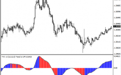
Candlestick charts not only provide trends in currency data but also provide bounds on the daily variation in exchange rates. However, what is more interesting is that candlestick charts also form a good measure of investor confidence in a particular foreign currency. We present an example of a candlestick chart below. Over each trading day, there is a box-and-whiskers-type figure. The box is darkened if the exchange rate closed lower than its opening price. The box is white if the opposite happened. If the box is black, the top of the box represents the opening price and the bottom represents the closing price. If the box were white, the opposite is the case. The top and bottom of the whiskers represent the daily high and low for the rate respectively.
It is exactly this attention to consumer confidence that led Japanese futures traders to turn to this chart form as early as the 1700s. In fact the distinction between candlestick charts and line and bar charts are historically the geographical difference in preference between Japanese and American traders. (Things have changed, however, and the candlestick form has become ubiquitous in America as well.)
A somewhat confusing aspect of candlestick charts is how conflicted Japanese traders were with the importance of prices. They thought, on one hand, that asset prices were the most important information that a trader could have before making a trade yet, simultaneously, found that asset prices did not correlate directly to the underlying value of the asset at hand. This is to say that the investors would reflect their views on the asset market in the prices they bid and asked for but that their views were not necessarily commensurate with inherent market value. Rather, these bids also involved their emotions and apprehensions to a certain extent. The reliance of traders on their emotions implied that markets would fluctuate with investor confidence.
Bar charts
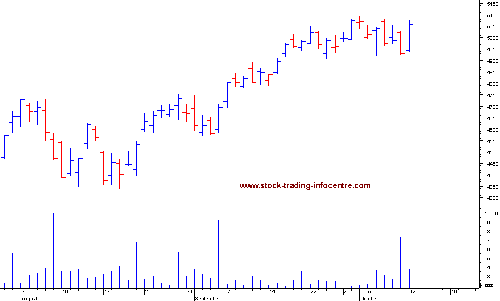
Below, we present a comparison of a bar chart and a candlestick chart of the same financial information. It is immediately apparent that this chart form leaves out some information. Namely, it gives the daily high and low values, but leaves out the opening price (and therefore the day’s swing), only giving the closing price which is marked as a tick on the whisker.
While the bar chart does leave out certain data values, there are someadvantages to this chart form as opposed to the candlestick chart. The bar chart is much less cluttered than the candlestick chart and analysts can consistently fit in more data values into less chart space with the bar chart format.
Line charts
Line charts provide yet another charting method for financial data. Their popularity stems from the fact that they are the easiest type of chart to read. In a day-by-day line chart, as in the one below, the only information above each day is the day’s closing exchange rate. It is also the most amenable to presenting the most data.
As one can clearly see, the con to this type of chart is that it leaves out the most information. As was stated earlier, candlestick and bar charts provide the trader with the high and low exchange rate values, as well as the closing rate (and also the opening rate in the case of candlestick charts). This information is useful in the sense that it gives the trader a sense of the asset’s volatility and direction. Line charts do not package this information well.
However, it should be noted that if the trader has more data values, it is possible to make line charts very informative. Most asset ticker websites nowadays have continuous streaming financial data, which means that their line charts contain all the data that is available on a particular asset, including exchange rates that the forex trader might be interested in.
On the other hand, while the line chart acts as a graphical representation of the exchange rate as a function of time, it does not organize the high and low prices for that particular exchange rate in relation to the opening and closing prices as succinctly as a candlestick chart would. Rather, it gives the trader all of that same information plus more, arranged chronologically by second.


