An Introduction To Ichimoku Charts In Forex Trading
Post on: 7 Апрель, 2015 No Comment
The Ichimoku Kinko Hyo or equilibrium chart isolates higher probability trades in the forex market. It is new to the mainstream, but has been rising incrementally in popularity among novice and experienced traders. More known for its applications in the futures and equities forums, the Ichimoku displays a clearer picture because it shows more data points, which provide a more reliable price action. The application offers multiple tests and combines three indicators into one chart, allowing the trader to make the most informed decision. Learn how the Ichimoku works and how to add it to your own trading routine.
Getting to Know Ichimoku
Before a trader can trade effectively on the chart, a basic understanding of the components that make up the equilibrium chart need to be established. Created and revealed in 1968, the Ichimoku was developed in a manner unlike most other technical indicators and chart applications. Usually formulated by statisticians or mathematicians in the industry, the indicator was constructed by a Tokyo newspaper writer named Goichi Hosoda and a handful of assistants running multiple calculations.What they came up with is now used by many Japanese trading rooms because it offers multiple tests on the price action, creating higher probability trades. Although many traders are intimidated by the abundance of lines drawn when the chart is actually applied, the components can be easily translated into more commonly accepted indicators. (For related reading, see A Glance At An Equilibrium Chart .)
Essentially made up of four major components, the application offers the trader key insight into FX market price action. First, we’ll take a look at both the Tenkan and Kijun Sens. Used as a moving average crossover. both lines are simple translations of the 20- and 50-day moving averages. although with slightly different time frames.
1. The Tenkan Sen — Calculated as the sum of the highest high and the lowest low divided by two. The Tenkan is calculated over the previous seven to eight time periods.
2. T he Kijun Sen - Calculated as the sum of the highest high and the lowest low divided by two. Although the calculation is similar, the Kijun takes the past 22 time periods into account.
What the trader will want to do here is use the crossover to initiate the position — this is similar to a moving average crossover. Looking at our example in Figure 1, we see a clear crossover of the Tenkan Sen (black line) and the Kijun Sen (red line) at point X. This decline simply means that near-term prices are dipping below the longer term price trend, signaling a downtrending move lower.
Figure 1 — A crossover in similar Western branded fashion
Now let’s take a look at the most important component, the Ichimoku cloud, which represents current and historical price action. It behaves in much the same way as simple support and resistance by creating formative barriers. The last two components of the Ichimoku application are:
3. Senkou Span A - The sum of the Tenkan Sen and the Kijun Sen divided by two. The calculation is then plotted 26 time periods ahead of the current price action.
4. Senkou Span B - The sum of the highest high and the lowest low divided by two. This calculation is taken over the past 52 time periods and is plotted 26 periods ahead.
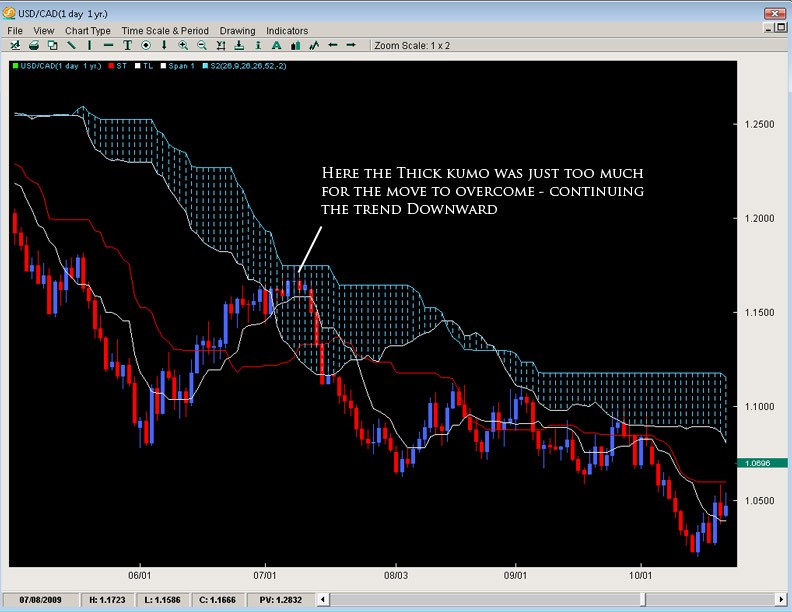
Once plotted on the chart, the area between the two lines is referred to as the Kumo, or cloud. Comparatively thicker than your run-of-the-mill support and resistance lines, the cloud offers the trader a thorough filter. Instead of giving the trader a visually thin price level for support and resistance, the thicker cloud will tend to take the volatility of the currency markets into account. A break through the cloud and a subsequent move above or below it will suggest a better and more probable trade. Let’s take a look Figure 2’s comparison. (If this seems a little over your head, check out our Forex Walkthrough Charts . Economics . Trading . or you could start at Beginner .)
Taking our USD/CAD example, we see a comparable difference between the two. Although we see a clear support at 1.1522 in our more standard chart (Figure 2), we subsequently see a retest of the level. At this point, some trades probably will be stopped out as the price action comes back against the level, which is somewhat concerning for even the most advanced trader. However, in our Ichimoku example (Figure 3), the cloud serves as an excellent filter. Taking the volatility and apparent take back into account, the cloud suggests a better trade opportunity on a break of the 1.1450 figure. Here, the price action does not trade back, keeping the trade in the overall downtrend momentum.


