Understanding Point and Figure Charts
Post on: 2 Июль, 2015 No Comment
Related Technical Analysis articles
Understanding Point and Figure Charts
The modern point and figure (P&F) chart was created in the late nineteenth century and is roughly 15 years older than the standard OHLC bar chart. This technique, also called the three-box reversal method, is probably the oldest Western method of charting prices still around today.
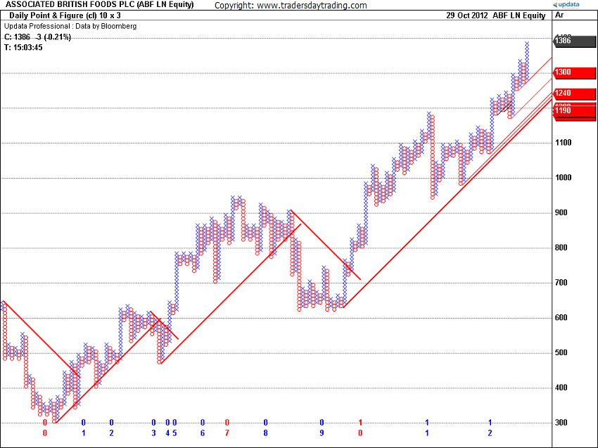
Its roots date back into trading lore, as it has been intimated that this method was successfully used by the legendary trader James R. Keene during the merger of U.S. Steel in 1901. Mr. Keene was employed by Andrew Carnegie to distribute the company shares, as Carnegie refused to take stock as payment for his equity interest in the company. Keene, using point and figure charting and tape readings, managed to promote the stock and get rid of Carnegies sizable stake without causing the price to crash. This simple method of charting has stood the test of time and requires less time to construct and maintain than the traditional bar chart. See Figure below.
The point and figure method derives its name from the practice of price being recorded using figures (Xs and Os) to represent a point, hence the name Point and Figure. Charles Dow, the original founder of the Wall Street Journal and the inventor of stock indexes, was rumored to be a point and figure user. Indeed, the practice of point and figure charting is alive and well today on the floor of all futures exchanges. The methods simplicity in identifying price trends and support and resistance levels, as well as its ease of upkeep, has allowed it to endure the test of time, even in the age of web pages, personal computers, and the information explosion.
The elements of the point and figure anatomy are shown later in Figure below.
Two user-defined variables are required to plot a point and figure chart, the first of which is called the box size. This is the minimum grid increment that the price must move for it to satisfy the plotting of a new X and O. The selection of the box size variable is usually based upon a multiple of the minimum tick size determined by the commodity exchange. If the box size is too small, then the point and figure chart will not filter out white noise, while too large a filter will not present enough detail in the chart to make it useful. I recommend initializing the box size for a FOREX P&F chart with the value of one or two pips in the underlying currency pair.
The second user-defined parameter necessary to plot a point and figure chart is called the reversal amount. If the price moves in the same direction as the existing trend, then only one box size is required to plot the continuation of the trend. To filter out small fluctuations in price movements (or lateral congestion), however, a reversal in trend cannot be plotted until it satisfies the reversal amount constraint. Typically, this value is set at three box sizes, although any value between one and seven is a plausible candidate. The daily limit imposed by most commodity exchanges can also influence the traders selection of the reversal amount variable.
Point and Figure Algorithm
- Upward trends are represented as a vertical column of X s, while downward trends are displayed as an adjacent column of O s.
- New figures (Xs or Os) cannot be added to the current column unless the increase (or decrease) in price satisfies the minimum box size requirement.
- A reversal cannot be plotted in the subsequent column until the price has changed by the reversal amount times the box size.
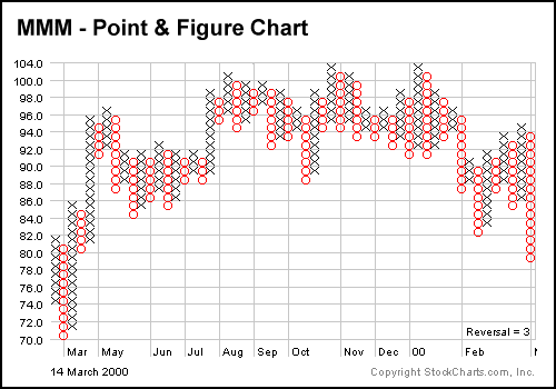
Point and figure charts display the underlying supply and demand of prices. A column of Xs shows that demand is exceeding supply (a rally); a column of Os shows that supply is exceeding demand (a decline); and a series of short columns shows that supply and demand are relatively equal. There are several advantages to using P&F charts instead of the more traditional bar or candlestick charts.
Advantages of P&F Charts
P&F charts automatically:
- Eliminate the insignificant price movements that often make bar charts appear noisy.
- Remove the often-misleading effects of time from the analysis process (whipsawing).
- Make trendline recognition a no-brainer.
- Make recognizing support and resistance levels much easier.
Nearly all of the pattern formations discussed earlier have analogous patterns that appear when using a standard OHLC bar chart. Adjusting the two variables, box size and reversal amount, may cause these patterns to become more recognizable.
P&F charts also:
- Are a viable online analytical tool in real time. They require only a sheet of paper and pencil.
- Help you stay focused on the important long-term price developments.
The author uses a point and figure routine in which the reversal is not a number of boxes but a percentage of the previous column. This accommodates his trading method as described in Goodman Wave Theory .
For a more detailed examination of this charting technique, we recommend Point & Figure Charting by Thomas J. Dorsey (John Wiley & Sons, 2007).
Adapted from Getting Started in Currency Trading.


