Common Chart Patterns
Post on: 10 Июнь, 2015 No Comment
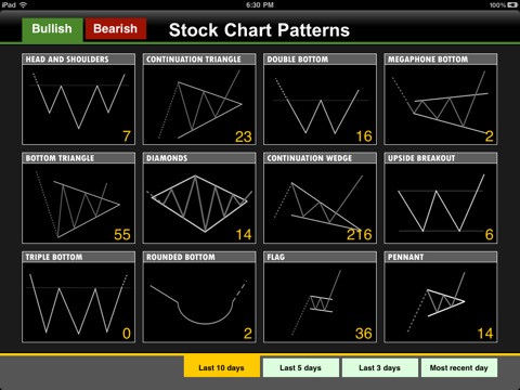
Bollinger Bands
Perhaps the most frequently encountered type of chart in the forex world are those depicting Bollinger Bands. Named after John Bollinger, a forex trader who operated mainly during the 1970s and 80s, the Bollinger band is based a rolling average of a given currency pair. Two lines run parallel to the line. For example, a middle line will follow the daily average, and then the outside lines will run parallel at +.1% and -.1% of the average line.
With this visual aid, traders can see where the value of the currency pair currently is in relation to its average value. The object is to adjust the outer two bands so that they represent the peak and valleys of the currency pair. That way, traders can by at the low and sell at the high, thus, even if a currency is not moving much over the course of the day, traders can nonetheless make significant profit with this technical trading tool.
The top and bottom can be adjusted to more accurately reflect the currency’s movement in certain environments. Daily volatility is the most important variable in regards to the size of the Bollinger band.
For information on trading patterns in the Bollinger Band and other major charts, see the “Important Chart Patterns” essay.
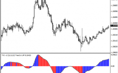
MACD is short for Moving Average Convergence Divergence. This chart is used to try to spot trends as they are beginning. Obviously, getting in on a trend at the beginning and not the end is one of the most important aspects of trading.
Let’s explain the MACD by way of an example. The MACD consists of two lines and a bar chart. It is generally set at 12-26-9. The 12 means the more erratic line is set as a rolling average of the 12 previous days, the smoother line is the past 26 days, and the 9 means the bar chart is a 9 day rolling average of the difference between the two lines. By analyzing the difference between the two lines, the bar chart at the bottom can help predict new trends, and thus make traders a good amount of money.
The MACD is a very popular, but very basic chart. Its predictive abilities can often be powerful, but are often enough prone to error. It is better at gaging the strength of a trend then it is at predicting the direction of that.
The Parabolic SAR
SAR stands for Stop And Reversal. It’s another one of the most important graphs used by technical traders. It is a very simple graph that is easy to use. The buy and sell candles are graphed, and a small dotted line follows along them, symbolizing possible reversals in the movement of a price of a currency.
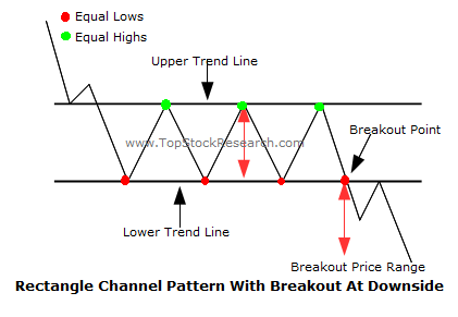
When the dots are above the candles, it potentially signals it is time to sell. When they are below, it may be time to buy. It is as simple as that.
Stochastics
Developed by George Lane in the 1950s, stochastics are indicators that attempt to measure when a currency is oversold or overbought. The chart is based on a 100-point scale, and is based on relatively complex mathematical models. When the chart is above 80, that is a sign that the market is overbought, and it is time to sell. When it is under 20, that is a sign the market is oversold and it is time to buy. Some trades use different benchmarks, such as 75-25, or 70-30.
Relative Strength Index
The relative strength index, or RSI, is very similar to stochastics. It is a 100 point scale that measures whether the market is oversold or overbought. It is very similar to stochastics in function, but based on somewhat different variables.
Now that you’ve gotten a very basic understanding of the charts, you are ready to read the “Important Chart Indicators” essay so you start to know how to use them.


