Stock Charts Tell You More Than the Indices
Post on: 16 Март, 2015 No Comment
coh
qcom
ovti
ABC easy, as we’ll bounce by 3. That mantra has served traders well for many years now. But I have to say, I’m not really trusting this small bounce. It’s hard to say that, though.
For instance, this morning, Voxeljet (VJET ) was up yet again. The chart looked great, so how do you sell? Plain and simple, by clicking the close position button.
Sometimes we get caught up in over-thinking or over-analyzing things. We get caught up in all the glory of social media. We get caught up in folks telling us we have to have stocks or we have to be trading. But it’s hard.
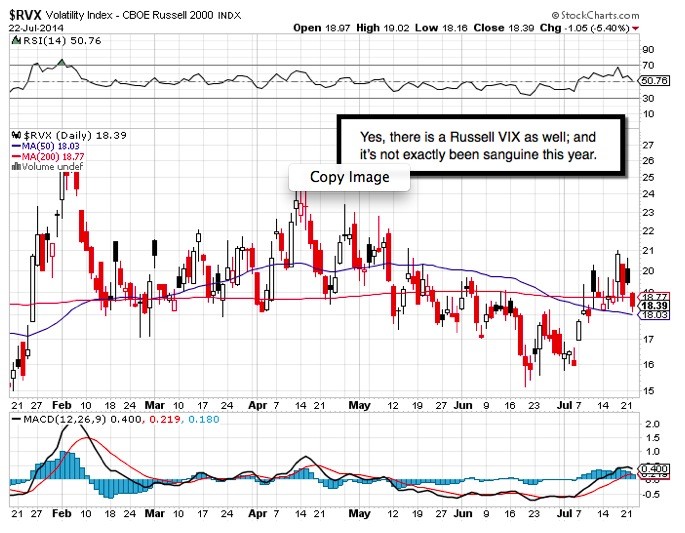
It doesn’t get any easier looking through charts either. Among the poor charts I see right now are those of Apple (AAPL ), Cisco Systems (CSCO ), IBM (IBM ), Coach (COH ) and Qualcomm (QCOM ), which I loved for quite some time but now have to kick to the sidelines. The chart just doesn’t warrant buying. Or OmniVision Technologies (OVTI ), which was another one I liked, but it now looks to fill the gap lower. I tried some rare-earth names, but today I’ve taken my losses on those shares and recognized that I am wrong with a long thesis there. That was nothing more than a dash for trash that didn’t turn into cash for me.
Then again, I see many good charts still out there. Facebook (FB ) continues to impress. For every Coach chart, there is a Restoration Hardware (RH ) chart saying that things aren’t so bad. Ford (F ) and General Motors (GM ) say there is still hope for the auto sector. Google (GOOG ) and Baidu (BIDU ) yell out that tech and search are still alive. If you don’t like Qualcomm or Cisco, then what about Corning (GLW ) or TripAdvisor (TRIP )? That’s what makes going to cash hard. There’s lot of good to offset the bad.
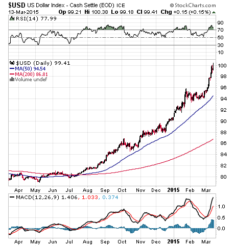
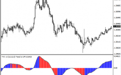
I prefer to use scans to try and find breakout names for intraday or short-term swing trades, but not everyone has that comfort level. Another approach is to make a list of anywhere from 20 to 75 names and create a watch list. My preference would be to use software that enables you to mark basic trendlines on the chart and have them saved. If that isn’t possible, then at least get a chart where you can post the moving averages, such as an eight-day and 21-day or even 20-day and 50-day. The goal here is, once they are marked, to scroll through all these charts in a fairly quick fashion at the end of the day or prior to the next trading day.
Once trendlines are drawn, it will be simpler to spot breakouts or breakdowns to focus the trading day upon. Furthermore, you can get a better overall feel for the performance of a larger group of stocks. If many are breaking their eight-day or 20-day moving averages at the same time, but the market hasn’t reversed course, then maybe it is time to be cautious. I’ve found this to be a much better leading indicator than the index charts alone.
At the time of publication, Collins was long CSCO, CSCO puts; short CSCO calls.
Please note that due to factors including low market capitalization and/or insufficient public float, we consider VJET to be a small-cap stock. You should be aware that such stocks are subject to more risk than stocks of larger companies, including greater volatility, lower liquidity and less publicly available information, and that postings such as this one can have an effect on their stock prices


