Sharpe Ratio Calculator
Post on: 14 Май, 2015 No Comment
NestEgg | Interactive Visualization
TRY our new beta
Enter a stock ticker, company, or fund to plot its efficiency.
What is the interest rate earned on cash
Start Over
How we calculate Sharpe Ratio
The ingenious feature of the Sharpe Ratio is its simplicity. To calculate an investment’s Sharpe Ratio you divide its excess return (more on this below) by its volatility. Because investment “risk” is difficult to define and quantify, academics and the financial industry use the volatility of returns; that is, the standard deviation of investment returns from their average. The more a stock bounces up and down, the riskier it probably is. For example, a highly indebted company in an industry tied to, say, the mortgage market might experience lots of volatility. A company with lots of cash in a boring, stable industry probably won’t see its stock move around as much.
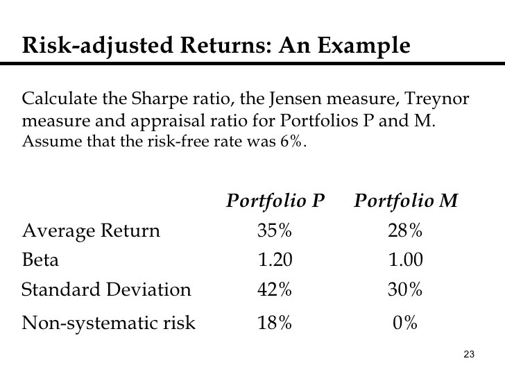
The reason for using excess returns is that a fundamental assumption behind modern portfolio theory is the existence of a risk-free rate of return, a completely safe asset. We want to know how much more return an asset can give an investor in return for the added volatility that comes with taking more risk. Standard industry practice is to use interest rates on short-term U.S. Treasury bonds when calculating Sharpe Ratios. At NestEgg we think that, for individuals, the risk-free rate is more likely the interest rate in a savings or money market account. So we ask you for your risk-free rate (use the slider) and it appears in the graph as a dotted blue line.
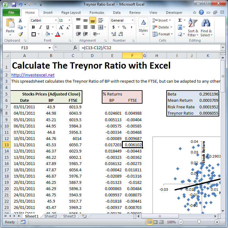
Finally, to calculate the Sharpe Ratio we want to know excess returns in the future, not the past. To predict expected returns, we use the widely adopted Capital Asset Pricing Model. It’s a little complicated, but essentially we use five years of historical data on daily returns to run a regression model which estimates how a stock or fund will respond to movements in the market as a whole. Rather than assume the market will follow its long-term average in the near future, we take your beliefs into account by asking you what you think the market will do. Believe the economy is going to tank? Drag the second slider to the left, and see how well bonds perform. Totally bullish? Drag it to the right, and watch the S&P 500 rise.
How to interpret the Sharpe Ratio calculator results
Our graphic Sharpe Ratio calculator lets you see how different investments compare. The left-hand axis represents expected returns while the bottom axis represents volatility. The blue dotted line represents the risk-free rate you entered and the range of values will change depending on how well you think the market will do and what your personal risk-free rate is. As you enter different tickers or names you’ll see them appear on the graph along with information about their performance. You’ll also see their stats appear below for quick comparison. Try comparing different types of assets to get a better idea of how the last few years have shaken up the markets. For example, the iShares Barclays Aggregate Bond Fund (symbol: AGG) is a popular ETF that tracks the bond markets. DJP is a large commodities fund and GLD invests in gold. Add in your favorite stocks for a new way to look at your portfolio.


