DIY Income Investor Portfolio Asset Allocation The Search Continues
Post on: 3 Июль, 2015 No Comment
Portfolio Asset Allocation: The Search Continues
Cutting up the cake — in new ways
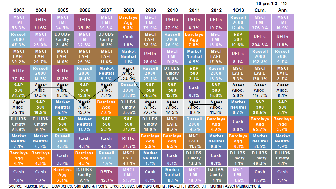
Is there any simple answer to the challenge of asset allocation? How can you find the best mix of cash, shares, government bonds and other asset classes?
Is it 50/50, 60/40 or 25/25/25/25?
The DIY Income Investor portfolio is a 50/50 split of high-yield dividend shares and fixed-interest securities.
There are a couple of other, similar, well-researched portfolio strategies, notably the 60/40 shares/bonds portfolio and the ‘Permanent Portfolio’ . with 25/25/25/25 in shares, bonds, cash and gold.
How do these approaches compare? And are there any lessons to be learnt?
The 60/40 Portfolio
This portfolio is commonly recommended in the US and is made up of 60% equities and 40% bonds. When Americans say ‘bonds’, they mean Treasury Bonds (the UK equivalent would be gilts), usually long-dated.
A recent analysis of the US 60/40 portfolio featured in the Economist’s Buttonwood Notebook (in turn showcased by Monevator ).
There are two sets of return in the table below — nominal and ‘real’ (i.e. taking account of inflation). The period covered is 1871(!) to 2010. The first four rows cover some selected longer periods, the rest relate to the returns over individual decades.
Over the entire period, a 60/40 mix has returned 7.6% nominal or 5.4% real.
One of the benefits of this type of diversification is the smoothness of the nominal returns; there are no negative decades.
However, look at the impact of inflation. The picture is still quite good but there are some poor decades:
- There were two decades of negative real returns for equities — the 1910s and the 2000s (although in the latter decade, substantial gains in bond helped to cushion this poor return
- Diversification didn’t work in the 1970s either when the second worst real return for bonds was accompanied by the third worst decade for shares; again inflation was the culprit.
One more thing to note: mean reversion. In nominal terms, the 1980s and 1990s were the two best decades for the 60/40 split, both almost double the historic average but they were followed by the third worst decade.
The ‘Permanent Portfolio’
Dealing with the impact of inflation is difficult. One solution may be another widely quoted US portfolio approach, the Harry Browne Permanent Portfolio — 25% each of stocks (shares), long-term bonds, cash and gold. This can be achieved directly or possibly via a single ETF or combination of ETFs.
In 2012 the Permanent Portfolio would have returned just under 7% — actually less than US Treasury Inflation-Protected Bonds (TIPS), but beating inflation by the ‘usual’ target amount of +3-6% with low volatility. So, not a particularly outstanding return but fairly safe: the key success of this approach was in the last couple of years of financial turmoil, when it benefited from the spectacular rise in the gold price.
Comparison with the DIY Income Investor Portfolio
Although I usually describe the DIY Income Investor portfolio as 50/50 (high-yield dividend shares and fixed-income), I do hold a fair amount of cash, so the overall split is more like 30/35/35. My cash is invested in a range of accounts ranging from current to ‘easy access’ to long-term savings bond (no access), yielding around 4%, which is just about keeping up with inflation.
In the 60/40 portfolio, the ‘bond’ element is more like ‘cash’ — particularly with the low savings returns available in the US — although I would expect most investors using this approach to hold a fair amount of cash as well, if only as an ‘emergency fund’. So the ‘cash’ element looks a little high to me. And neglecting other fixed-income opportunities means that investors would have missed out on the recent fixed-income security bubble.
My major problem with the Permanent Portfolio is the gold element — which generates no income. So I need to look for another component that has a similar inflation-resistant character to gold.
The DIY Income Investor portfolio did very well last year — and this out-performance continues into the New Year (with a 2.8% gain in January). I am hoping that the high-yield character of the portfolio might be expected to perform better against inflation than the broad equity/bond markets described above.
So, overall, I take these data to be encouraging — but not yet definitive. I would like to back-test my own approach but I haven’t found an accessible way of doing this yet. And the search for more reliable returns from a high-yield income investing approach continues, particularly the need to deal with widespread inflation — which might be coming .
I am not a financial adviser and the information provided does not constitute financial advice. You should always do your own research on top of what you learn here to ensure that it’s right for your specific circumstances.


