Checking In on the AllETF Portfolio
Post on: 19 Апрель, 2015 No Comment
- In June of 2007, I published an article on how to design an all-ETF portfolio using a modern approach to asset allocation. The premise of this article was the following:
Let’s imagine that you want to build a portfolio of ETFs but want to do something better than just following a generic pie chart.’ What does it mean to do something better than the pie chart approach? First, you want to see if you can get more return for the total amount of risk in your portfolio-and that means that you have to be smart about diversification. Second, you may have some other broad themes in mind. One of the key themes that I think about is how coupled I want my portfolio to be to the S&P500, for example.
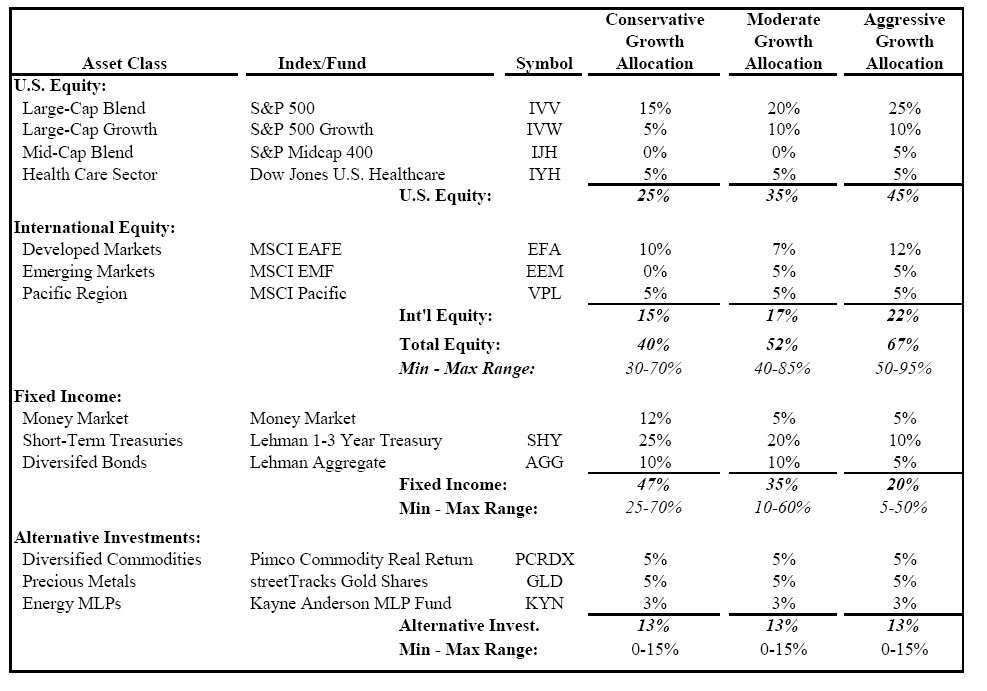
What does it mean to be smart about diversification? The main thrust of this article-and of many of my articles-is that diversification benefits are measurable. Using a good portfolio planning tool, investors can develop portfolios with higher returns (without increasing risk) than will be possible simply by arbitrarily choosing an asset allocation (i.e. a pie chart’ portfolio). I then proceeded to propose the following portfolio as an example of this theory put into practice:
While most portfolios start by specifying asset allocations based on some conventional rules of thumb, this portfolio is based entirely on guidance from Quantext Portfolio Planner [QPP], a portfolio planning tool that assists in identifying portfolios that provide the most diversification benefit. This process is explained in the original article. The portfolio that results is unlike the standard pie charts. There is no allocation to total market kinds of indices like the S&P500 or the EAFE index. The majority of this portfolio is focused on individual sectors, with the single largest sector being utilities. This portfolio has 30% allocated to bonds, but this is spread between TIPS and high-yield bonds-there is no allocation to a broad bond index like MSCI Aggregate.
The reason that this portfolio does not have allocations to broad market-cap weighted all market index funds is that they do not provide superior diversification benefits. Back in fall of 2006, I wrote an article showing that the EAFE index (EFA ), and the NASDAQ 100 index (QQQQ ) were both correlated to the S&P500 (SPY ) at levels greater than 80%.
This portfolio leaves out allocations to broad emerging markets indices such as the MSCI Emerging Markets Index for the same reason. For years, many advisors and portfolio managers had been touting what was called the de-coupling between emerging markets and the U.S. markets. This effect meant that emerging markets (and developed foreign markets) would not be dragged down by a big decline in the U.S. I simply never saw evidence for de-coupling, which is why this portfolio has no allocation to funds like EEM.
Higher levels of correlation mean lower diversification benefits. I noted that energy and utilities, by contrast, provided a high level of diversification benefit relative to domestic equities. For more details on how this portfolio was designed, please see the original article.
The period since the all-ETF portfolio article was published has provided a good stress test for any asset allocation. The S&P500 is down about 13% for the period from June 2007 through July 2008.
QPP’s projections for this portfolio (from the original article) were the following:
The Portfolio Stats section shows the long-term QPP projections for this portfolio published in the original article, while the cells below show historical data for three years through May 2007. Several points are notable. First, the three years through May 2007 had been good for broad equity indices, with high returns and low volatility. The S&P500 had average more than 10% per year (even before we include dividends), and the annual standard deviation of the S&P500 (the standard measure of volatility) was about 7%, less than half of its average level over recent decades (see table above).
QPP showed that even this All-ETF portfolio had generated returns above its long-term expected level (i.e. trailing three year return of 14.9% vs. projected average annual return of 10.5%). Further, the projected portfolio volatility (the standard deviation) was 11.2%, as compared to 5.1% over the trailing three years (see table above). This portfolio, while good in the long-term, was due for some correction in the near term (as was the S&P500). No portfolio can out-perform forever: a trailing return greater than the projected average return indicates some potential for reversion to the mean.
The original article used data through May 2007, but the article was published in mid-June. To avoid any overlap in available data, we will look at the portfolio performance from July 1, 2007 through July of 2008. For the period from July 2007 through July 2008, we get the following results:
The All-ETF portfolio has beaten the generic 70/30 portfolio by almost 6% in average annual return (-0.5% for the All-ETF vs. -6.3% for the 70/30), with less volatility, in the 1+ year period since this article was written.
In a fairly recent article. I suggested that a really well diversified portfolio with a standard deviation of about 10% (forward-looking, not trailing) could be expected to generate about 10% in return per year. This performance could be compared to a generic 60/40 stock/bond mix which would be expected to generate about 7.5% per year in average return for the same level of volatility (standard deviation of about 10%). This result implied a diversification premium-the benefit of better diversification-on the order of 2.5% per year for portfolios at this risk level.
We are looking at generally similar cases here (albeit only 30% bonds), but we can draw some qualitative comparisons. If we figure a 2.5% per year diversification premium, and the all-ETF portfolio has generated almost 6% greater return over the 1.1 year period, we can see that part of the out-performance is simply due to chance-and is not expected to persist in the long-term.
So how do things look in QPP as we go forward? I ran the All-ETF portfolio through QPP using the default settings (including three years of trailing data to initialize the model). The results are shown in the table below.
The projections from QPP are given in the Portfolio Stats table. The projected long-term return for this portfolio is 10% per year (close to the original projection). The projected volatility is a bit higher than the original calculation. Note that Reversion-to-The-Mean [RTM] is now on our side-the projected average annual return is greater than the trailing average annual return.
We could certainly adjust this portfolio so that it would have a higher projected return to projected risk, but the point of this article is to provide a look at how this portfolio has held up in the midst of a broad market decline.
These results are not the result of superior timing or any insight into how any sector would perform. These results simply demonstrate the power of portfolio theory, applied properly. While many investors have never really been exposed to this perspective on how to develop portfolios, there is considerable evidence of the effectiveness of this approach. This article may serve as one more data point-albeit a small one. I am confident, however, that this portfolio will provide consistently solid long-term performance so that when I revisit it again at a later date, the same general conclusions will hold. As a final word, I will stress that this portfolio is not a recommendation-it is simply an example. Better portfolios can be built, and every investor must carefully consider whether any portfolio is appropriate for their specific needs.


