Best Chart Patterns To Trade For EyePopping Profits
Post on: 6 Июнь, 2015 No Comment
February 18, 2013 By Lance Jepsen
What are the best chart patterns to trade? There is a lot of confusion when you first start trading because everywhere you find different books and websites that claim different stock patterns or technical indicators are the best. How is a new trader going to know what the best chart patterns to trade really are with so many different opinions on the subject? In my 25+ years of stock trading experience, these are the best chart patterns to trade.
Best Chart Patterns To Trade
Double Top Chart Pattern
The Double Top chart pattern marks a tough area of resistance that Bulls failed to penetrate twice. Be-careful trading this chart pattern because the double top is not very reliable. Bulkowski estimates the double top predicts a trend reversal only 35% of the time. I prefer the Triple Top chart pattern to the Double Top pattern.
Triple Top Chart Pattern
The Triple Top chart pattern is really demoralizing for Bulls. It means that a level of resistance is so tough, that Bulls tried not once, not twice, but three times to break through the resistance level but each time they were defeated by the Bears. Bears gain confidence that Bulls can no longer keep taking the stock higher and so they pile in and the stock usually plunges lower.
Island Top Chart Pattern
The Island Top chart pattern can be 1 day or more. The opposite of the Island Top Chart Pattern is the Island Bottom Chart Pattern. Island chart patterns are sometimes referred to as a Bearish Island or Bearish Island Reversal (Island Top), and a Bullish Island or Bullish Island Reversal (Island Bottom). These are wicked chart patterns that strand either Bulls or Bears on an island and the only way off is to book massive losses.
Long Lower Shadow Chart Pattern
This is my favorite chart pattern to trade for huge profits. Some call this chart pattern a flush. It is a capitulation move by bulls who finally are squeezed out of a stock. Their panic selling causes the daily range on the stock to explode. The stock gets too cheap and within minutes, bargain hunters have stepped in to buy the bottom in anticipation for the next swing move up. The volume should drop off before the long lower shadow chart pattern appears.
Doji Chart Pattern
The doji chart pattern represents indecision by either Bulls or Bears that they can continue to take the stock either higher or lower. The doji is a favorite chart pattern to trade for swing traders as it often signals a swing in the opposite direction. It is sometimes called a spinning top chart pattern .
Oversold Chart Pattern
The oversold pattern is the best chart pattern to trade of any pattern. Many times, the Long Lower Shadow or Doji chart patterns lead to explosive gains because they are inside a larger oversold chart pattern. There should be a history of the stock bouncing off the oversold support level on the chart. The oversold chart pattern is swing trader Jason Bonds favorite pattern to trade.
Continuation Chart Pattern
The continuation chart pattern can lead to monster profits because these patterns continue for an extended period of time. It is one of my favorite day trading chart patterns as well. It can be a series of higher lows, higher highs, and even a consolidation or sideways move before a breakout.
Breakout Chart Pattern
The breakout chart pattern is my least favorite pattern because you are always chasing. Nevertheless, a breakout above resistance can be very profitable even if you are a little late to the Bull party. Breakout chart patterns are more accurate in a trending market (i.e. buy high and sell even higher). In the chart above, notice that often chart patterns will go through three stages: oversold, continuation, and breakout.
Frequently Asked Questions about Chart Patterns
What are chart patterns?
Chart patterns are a map of human behavior that repeats itself because history repeats itself. Neither history nor human behavior are random.
Traders use chart patterns to help predict future market behavior.
There are three types of trading patterns: oversold, continuation, and breakout patterns.
Lance Beggs with YourTradingCoach posted the excellent video below on chart patterns called YTC Intro to Technical Analysis (Module 4F) Chart Analysis Charting.
What is a candle chart pattern?
Candlestick charting is one of the oldest forms of technical analysis that dates back to the 15th century.
Candlestick charting compliments existing chart patterns such as support, resistance, and trend-lines while adding a deeper level of insight into market sentiment beyond the high low bars that dominated western trading until recently.
You will often hear the top traders on Wall Street like Jason Bond talk about a candle over candle pattern where the real body of the current day closes above the real body of the previous day.
CMC Markets PLC posted the excellent video below called Trading strategy- Learn about the basics of candlestick charting.
What is a gap down chart pattern?
A gap is a change in price levels between the low and open of two consecutive days, where the open of the current day does not equal the close of the previous day so as to form a noticeable gap on the chart.
A gap down occurs when the opening price is lower than the previous days low.
Sasha Evdakov with TradersFly.com posted the excellent video below called Understanding Gaps: Common, Breakaway, Runaway, and Exhaustion.
What is a flag chart pattern?
A Flag pattern is a continuation pattern where a small rectangle pattern slopes against the current trend. If the trend is up, the flag will slope down. If the trend is down, the flag will slope up.
PerfectStockAlert.com posted the educational video below called Flag Continuation Chart Pattern.
What is a triangle chart pattern?
Triangle chart patterns are continuation patterns. Triangle chart patterns get their triangular shape from a contraction in price range and converging trendlines. There are three types of triangle chart patterns: the Ascending Triangle, the Descending Triangle, and the Symmetrical Triangle.
Ascending Triangle Pattern
The Ascending Triangle pattern is often a bullish pattern that ends in a breakout to the upside. The Bulls have been able to take the stock back up to resistance on each swing while Bears are losing the ability to take the stock back down to the support area on each swing. An uptrend should already be in place for this to be considered a continuation pattern.
Ascending triangles often take a few weeks to form on the daily chart.
Descending Triangle Pattern
The Descending Triangle is often a bearish pattern that ends in a breakout to the downside. The Bears have been able to take the stock down to the support area on each swing while Bulls are losing the ability to take the stock back up to the resistance area each on each swing. A downtrend should already be in place for this to be considered a continuation pattern.
Symmetrical Triangle Pattern
Unlike the Ascending Triangle (bullish bias) and the Descending Triangle (bearish bias), the Symmetrical Triangle pattern has no bias. It is a time of indecision where the Bulls and Bears are evenly matched. However, once the market figures out which way it wants to go, the pattern ends in a breakout either to the upside or the downside.
Sanjay Chowdary posted the video below on Ascending and Descending Triangle chart patterns. It is made for the FOREX market but the same principles hold true for equity markets.
PerfectStockAlert.com posted the video below on the Symmetrical Triangle chart pattern.
What is a head and shoulders chart pattern?
A Head and Shoulders chart pattern is a giant continuation pattern that ultimately results in a downside breakout or breakdown when it occurs after an uptrend. The mirror image of the pattern, when it occurs after a downtrend, is called a Bulllish Head and Shoulders bottom.
The price target coming out of the pattern can be estimated by taking the length of the highest point in the head to the neckline.
Head and Shoulders Top (aka Bearish Head and Shoulders)
The Head and Shoulders Top is a continuation pattern until the breakdown and then it becomes a reversal pattern. The Head and Shoulders Top is made up of a left shoulder, a head, and a right shoulder. The neckline is drawn at the lows of each valley and the pattern is not valid until the neckline is closed.
Head and Shoulders Bottom (aka Bullish Head and Shoulders)
All of the same points hold true for a Head and Shoulders Bottom but the logic is reversed. It too is a continuation pattern until the breakout and then it becomes a reversal pattern. The Head and Shoulders Bottom has the mirror image or the reverse of a left shoulder, a head, and a right shoulder. The neckline is drawn at the peak of each shoulder.
Sasha Evdakov posted the excellent video below called Stock Market Charts: Head and Shoulders Pattern.
Christian with PerfectStockAlert.com posted the excellent video below called Inverse Head & Shoulders Bottom Reversal Pattern.
What is a bearish engulfing candlestick chart pattern?
The bearish engulfing candlestick pattern is made up of two consecutive candlesticks: the first candlestick is an up day or green candlestick, while the second day is a down day or red candlestick.
The second down day body of the candlestick must completely engulf the body of the first up day or green candlestick.
The bigger the second down day candlestick is, the more bearish the reversal signal.
YourTradingCoach posted the excellent video below called Candlestick Charting Vol 13 Bearish Engulfing Pattern.
What is a diamond pattern in chart?
A Diamond pattern (aka Diamond Top Formation) is the end of an uptrend. It is a continuation pattern until the pattern ends with a breakdown below support and the lower trend wall of the Symmetrical traingle and then it morphs into a reversal pattern. The first half of the Diamond pattern is a Megaphone pattern or Broadening pattern, and the second half is a Symmetrical Triangle pattern.
Diamond patterns usually form over several months. Volume remains high during the formation of this pattern. The Diamond Top indicates a reversal to a downtrend while the Diamond Bottom indicates a reversal to an uptrend.
FinVidsDotCom posted the video below called Diamond Tops & Diamond Bottoms Chart Pattern.
What is the most successful chart pattern?
The most successful chart pattern is the oversold pattern. It works well in both trading and trending markets. However, what seems like an oversold level seldom is. This is why the oversold pattern must be used in conjunction with other technical and fundamental indicators, short interest days to cover, and catalyst research. The other technical and fundamental indicators are talked about in my other lessons. Make sure you subscribe below so you can get these lessons emailed to you.
What time frame should I use for the long lower shadow?
Use the daily (end of day) candlestick and a 6 month chart. A 6 month chart should be a long enough time span for you to see if the long lower shadow is occurring at a major support level.
If you are watching a stock in real time, then a long lower shadow will take place in intra-day action and it will most likely feel like a flush (the handle on a toilet going down then popping back up quickly). A flush is an excellent entry point.
Below are two charts of the same stock that formed a long lower shadow on the daily chart, and what it looks like in intra-day trading action.
Which time frame is the best for swing trading?
There are two time frames you will use for swing trading: the daily, and 1 hour.
The daily time frame is the time frame you use for your stock screener. A chart going back 6 months is good to use.
The 1 hour time frame is the time frame you use to look for an entry, target price, as well as exit. Think of the 1 hour time frame as using a magnifying class to zoom in and better time your trades. A 20 day chart is good to use.
For example, in our stock screener we scanned for stocks with a long lower shadow:
Looking at the 1 hour chart, we can see that our next area of resistance after the flush is the previous days close up around $20 and so that is our target level.
If that range is too tight because theres not enough meat on the bone for the amount of money you are trading with, we pass on the flush and go back to our daily stock screener and look for another stock that formed a long lower shadow.
What is short interest as a percent of float?
Short interest as a percent of float is the percentage of shares short in relation to the number of shares that make up a stocks float. Float is just a shorter word used for shares outstanding.
The formula for calculating short interest as a percent of float is:
Number of shorted shares / Number of shares outstanding
For example, a stock with 2 million shares sold short, and 10 million shares outstanding, has a short interest of 20% (2 million / 10 million = 20%).
Many swing traders like Jason Bond have developed trading systems that use short interest as a tool to predict market direction. The logic is that if everyone has shorted the stock (so that there is a high short interest as a percentage of float), then the stock is already near its low and will move up when short sellers have to cover their positions (buy back the shares to close out their short positions).
Do not confuse short interest as a percentage of float with the short ratio. The short ratio is calculated by dividing the number of shorted shares by the average daily volume of a stock:
Number of shorted shares / Average daily volume
For example, a stock with 24 million shares sold short, that has an average daily volume of 2 million shares, has a short ratio of 12 (24 million / 2 million = 12). It would take 12 days for short sellers to completely close out their short positions at the average daily volume.
Some traders prefer to use the short ratio because it provides a number that is used by traders to determine how long, expressed in days, it will take short sellers to cover their short positions.
PerfectStockAlert.com posted the excellent educational video below called Short Interest Ratio or Days to Cover Ratio.
What is a candle over candle formation?
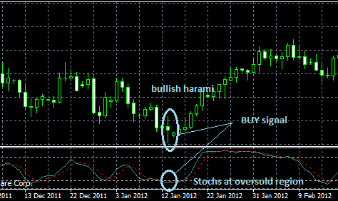
A candle over candle formation, also called a candle over candle reversal, could be a Bullish Kicker:
A candle over candle pattern could be a flush or oversold pattern. A candle over candle pattern is a two day pattern and as long as the close of the second day of the reversal is above the high of the first day, it could qualify as a candle over candle pattern:
In the chart above, GNCA has done a sweet flush, with a candle over candle reversal coming out of an RSI oversold, with a sweet volume spike. Thats beautiful.
Heres a candle over candle formation that took 3 days to get the signal:
The important lesson when dealing with candle over candle reversals is to not be too rigid with your definition of what a candle over candle reversal pattern is. In the chart of USAP above, after the doji on day one, an inverted hammer formed with the close of the day being almost even with the close of the previous day. This is not a good candle over candle signal. The long upper shadow suggests lots of selling near $30.50 and you dont know if the price of USAP will just chop out and go sideways. However, the third day clearly closed above the close of both the previous two days and so we finally have our candle over candle reversal signal.
It is important that the candle over candle pattern occurs after an extended move down. You want the RSI to be oversold although that is not mandatory. The candle over candle formation should occur at some significant support area. Finally, the stock needs to have a history of bouncing and running off that significant support level.
The best candle over candle chartist I know is Jason Bond. He taught me this pattern and it has really helped to improve my trading performance. Jason has several video lessons for clients where he teaches about the candle over candle formation.
What Is the Best Chart Pattern To Trade
Folks, Ive been trading for nearly 20 years and Im going to tell you, hands down, without a doubt, what I think the best chart pattern to trade really is.
The lesson below is going to be of tremendous value to you because Im going to short cut your learning and what has taken me nearly 20 years to realize: the oversold chart pattern is the best chart pattern to trade. The oversold pattern is also the best chart for day trading. But be warned. The real problem with buying stocks that are oversold is that they rarely are oversold. You know the same old story, buy low, and sell even lower for a loss. Youve also heard the old cliche, Dont try and catch a falling knife. Stocks that move lower often continue to go even lower.
In the lesson below you will learn how to greatly increase your odds of timing oversold stocks when they really have hit a bottom and are ready to turn. Put on your learning cap and strap yourself in, this is a rocking lesson you wont soon forget.
IF YOU THINK THIS LESSON WAS AWESOME, YOU OUGHT TO SEE WHAT ELSE JASON BOND (JB) HAS TO OFFER! CLICK HERE TO CHECK OUT HIS SERVICE! HES ON A HOT STREAK RIGHT NOW!
IF YOU THINK THIS LESSON WAS AWESOME, YOU OUGHT TO SEE WHAT ELSE JASON BOND (JB) HAS TO OFFER! CLICK HERE TO CHECK OUT HIS SERVICE! HES ON A HOT STREAK RIGHT NOW!
Do you have a question about this lesson that is not already covered? Use the form below to send in your question.


